Our Greenstory
This project involves revamping the brand to make it modern, fresh, and more aligned with its core values. Along with the new brand identity, a new website was also developed to reflect these changes and better represent the company’s vision and values, and support growth.
Client: Our GreenStory
Year: 2022 – 2024
Role: Rebranding, Prototyping, UX/UI Design
Design tools: Figma, Illustrator, Photoshop
About the company
Our GreenStory is an e-commerce company specializing in sustainable tools designed to help individuals and groups, such as large households, organize both personal and work-related tasks, ensuring a clear and efficient overview.
Case
The case owner requested a new website, but before we could begin development, we needed to create a brand book since the company lacked a consistent branding and brand identity.
Brand identity
The company had a brand identity, but it was inconsistent and lacked a clear direction. To address this, we collaborated with the case owner and the stakeholder to define a brand identity that truly reflects the core values of the company. Together, we documented the entire process in a comprehensive brand book, providing a clear and consistent guidelines for the brand moving forward.
A rebranded website
Once the brand book was finalized, the next step was updating the website. The previous site was outdated and lacked consistency, so we focused on developing a modern, cohesive design that aligned with the newly established brand identity. Additionally, we prioritized enhancing the user experience to make shopping easier and drive growth for the company.
The brand book
We created a brand book with detailed guidelines to ensure that the brand identity, design choices, and overall branding remain consistent across all platforms and materials. Additionally, we selected new colors that strongly represent the brand and its core values. Minor changes were also made to the logo to ensure it aligns seamlessly with the new brand guidelines.
Homepage
The homepage received a significant update, including the addition of a fullwidth slider/slideshow to prominently introduce the main products and showcase any ongoing promotions.
Product page
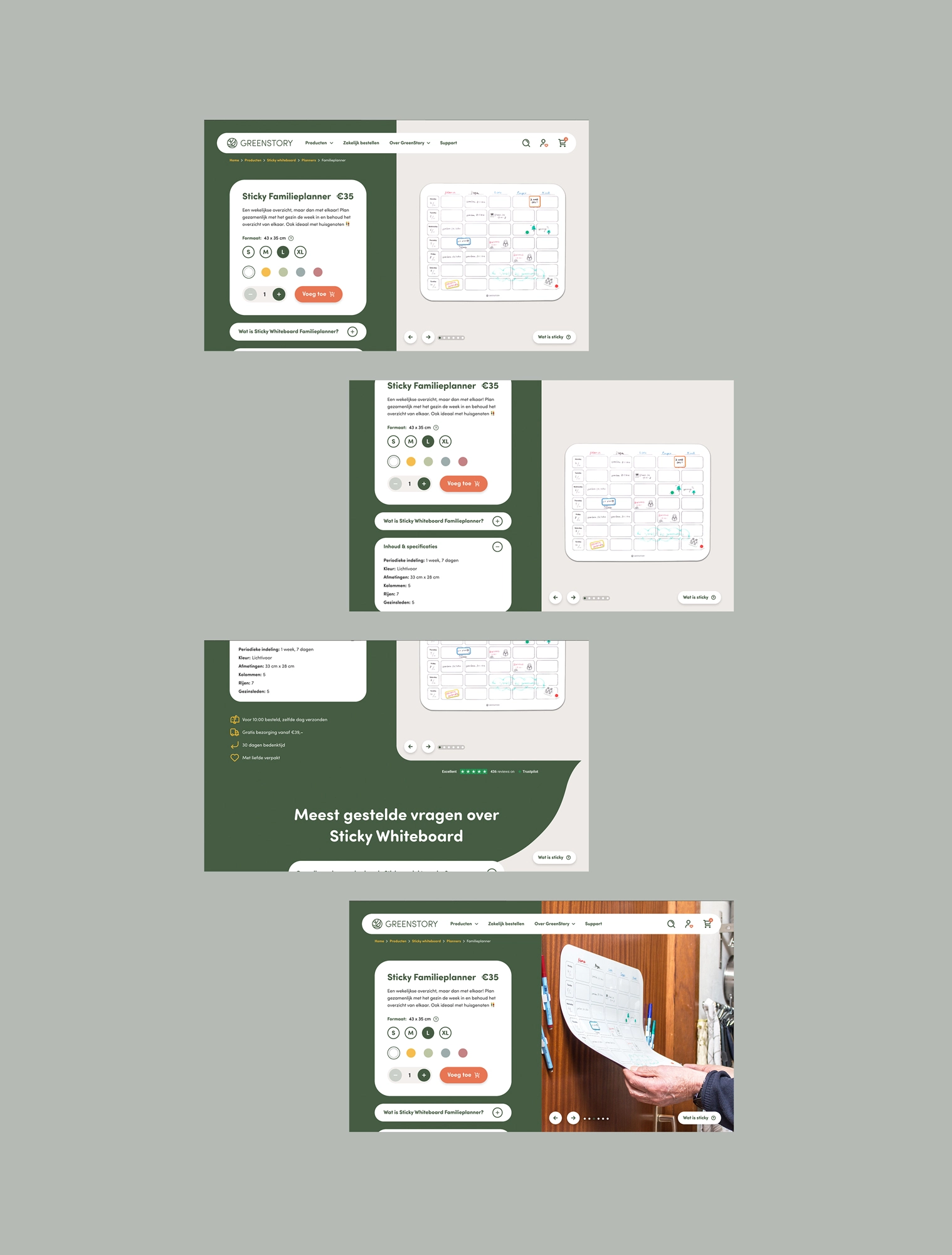
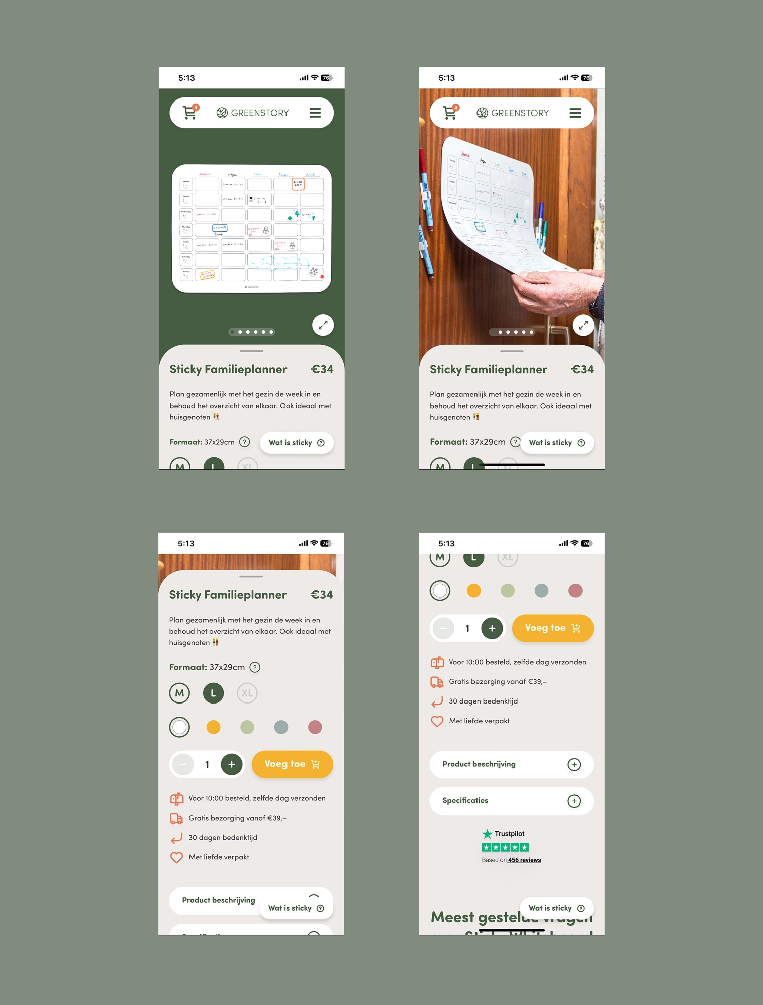
We optimized the product page significantly by adding a detailed slider that allows users to view multiple product images. Additionally, we incorporated social proof elements, including customer reviews and Trustpilot ratings, to build trust and enhance the shopping experience. To further boost revenue, we included relevant cross-sell items, encouraging customers to explore complementary products.
Navigation structure
Another significant change we made was simplifying the navigation structure. Previously, the navigation was confusing and felt like a maze. To improve this, we categorized the product items and created relevant subcategories within each main category, making it much easier for users to navigate and find what they’re looking for. Additionally, we enhanced the navigation experience by incorporating interactive elements: a video to highlight specific products on the desktop version and a slider on the mobile version, adding both engagement and visual appeal.
You’ve reached the end 🥳
© 2024 anna by Anna Tai


