Lung Fung
This project involves developing a new, modern brand identity for an outdated restaurant. The scope includes creating a fresh color scheme and redesigning the interior to align with the new branding, ensuring a cohesive and modern look and feel throughout the restaurant.
Client: Restaurant Lung Fung
Year: 2020
Role: Web design, (re)branding, Photography
Design tools: Adobe XD, Illustrator, Photoshop
This project was done in collaboration with Liam Chang.
About the company
Lung Fung is a Chinese Surinamese restaurant located in The Hague. It has been a family-run establishment for generations and is currently operated by the third generation.
Past projects
Lung Fung has been a long-term client of mine. My role within the company focused on driving financial growth through strategic design and marketing initiatives. Over the years, I’ve redesigned their website (the image shown on the left is the website redesigned in 2017), created multiple versions of their menu in both physical and digital formats, and developed numerous graphics for their social media channel. These efforts have been part of an ongoing collaboration to enhance their brand presence and keep the restaurant’s image fresh and engaging.
Past projects
Lung Fung has been a long-term client of mine. My role within the company focused on driving financial growth through strategic design and marketing initiatives. Over the years, I’ve redesigned their website (the image shown above is the website redesigned in 2017), created multiple versions of their menu in both physical and digital formats, and developed numerous graphics for their social media channel. These efforts have been part of an ongoing collaboration to enhance their brand presence and keep the restaurant’s image fresh and engaging.
Case
Lung Fung has always been a traditional Chinese, Surinamese eatery with a strong base of regulars, particularly those aged 40 to 50. However, the restaurant has struggled to attract younger customers. I was tasked with developing a new branding strategy for Lung Fung to make it a trendy hotspot for young people. The goal is to refresh the restaurant’s image while still honoring its heritage, making it appealing to a new generation.
Rebranding
We began the project by redesigning the brand identity to create a modern and appealing look. This involved updating both the logo and the color scheme, which were outdated and failed to attract younger customers. While we made minor adjustments to the logo to maintain its recognizability, we opted for a bolder and more prominent design. For the color scheme, we retained the primary orange to keep it recognisable and introduced complementary secondary colors to enhance the overall visual appeal. With these changes, we created a playful and engaging look that resonates more with younger customers, making the brand feel fresh and modern.
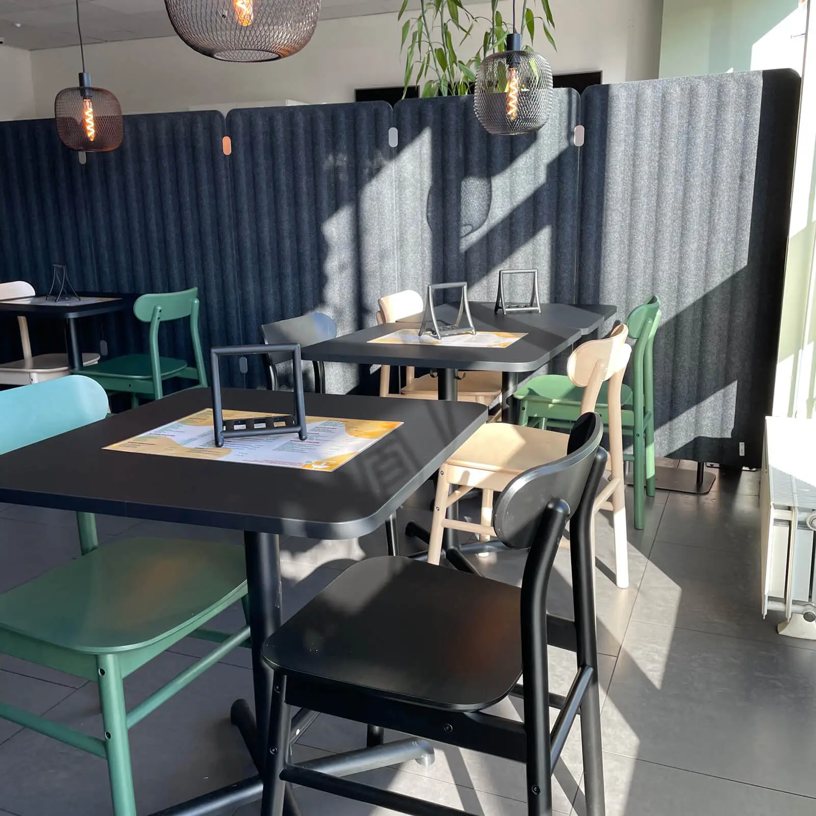
Interior design
The interior of Lung Fung was quite outdated, with a dominant and unappealing orange color scheme. We made significant updates by removing the orange and adopting a modern, neutral color palette with complementary green accents. To achieve a balanced and contemporary feel, we incorporated natural wood elements and greenery, creating a more inviting and stylish atmosphere. To maintain a hint of the original orange, we added orange flowers to the leafy wall decor. Overall, the space was transformed into a modern environment with plenty of greenery, making it more appealing to younger customers.
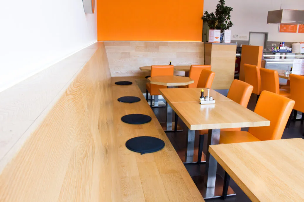
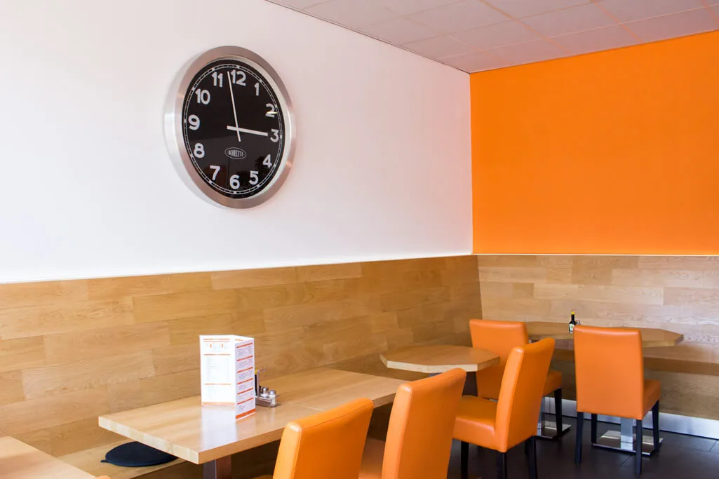
Old interior
With lot of orange color, light wood colored tables and wall-mounted bench.
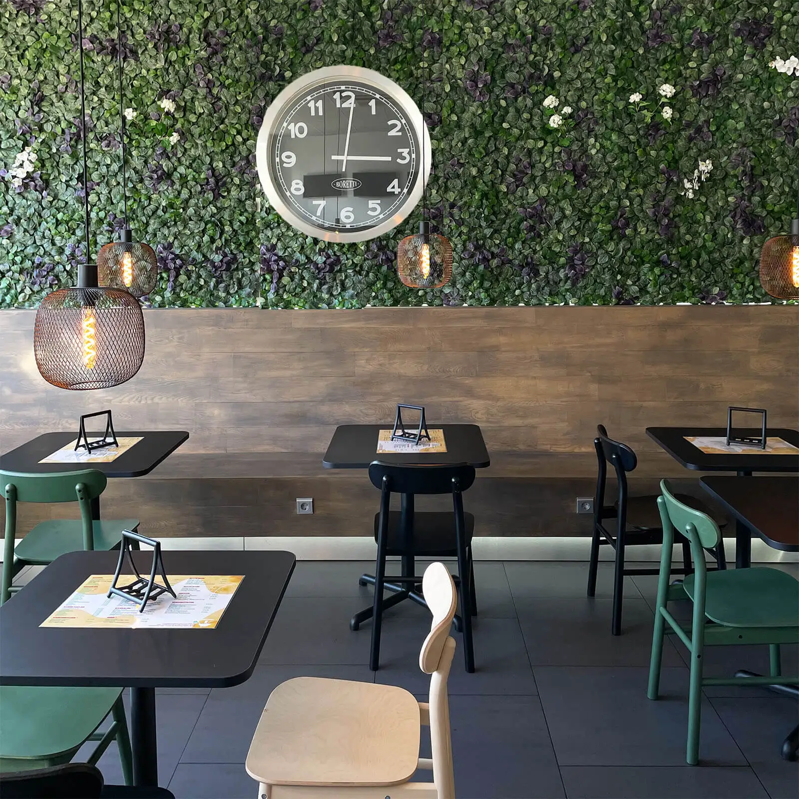
New interior
The wall-mounted bench was painted a rich, dark brown to enhance its wooden appearance, and we incorporated a mix of neutral colors to complement the new color scheme. We retained the clock in the interior as the restaurant’s location is near a train station, where time is crucial for travelers.
Old interior
With lot of orange color, light wood colored tables and wall-mounted bench.
New interior
The wall-mounted bench was painted a rich, dark brown to enhance its wooden appearance, and we incorporated a mix of neutral colors to complement the new color scheme. We retained the clock in the interior as the restaurant’s location is near a train station, where time is crucial for travelers.
You’ve reached the end 🥳
© 2024 anna by Anna Tai