Cool Drinks
This project involves developing a new brand identity, including the creation of a brand-new logo.
Client: Cool Drinks
Year: 2019
Role: Branding & Logo design
Design tools: Illustrator, inDesign, Photoshop
About the company
Cool Drinks is the supplier of Island Oasis products in the Benelux. Island Oasis products are used by hospitality establishments, providing great ease of use in making the most delicious drinks.
Case
The company had an outdated brand identity that no longer resonated with its target audience. I was tasked with revitalizing their image by developing a fresh, summery brand and logo. This involved a complete redesign of their visual elements, including color schemes, typography, and imagery, to evoke a sense of warmth and refreshment. The goal was to create a cohesive and appealing look that would attract and engage customers, ultimately aligning the company’s visual identity with its core values and market positioning.
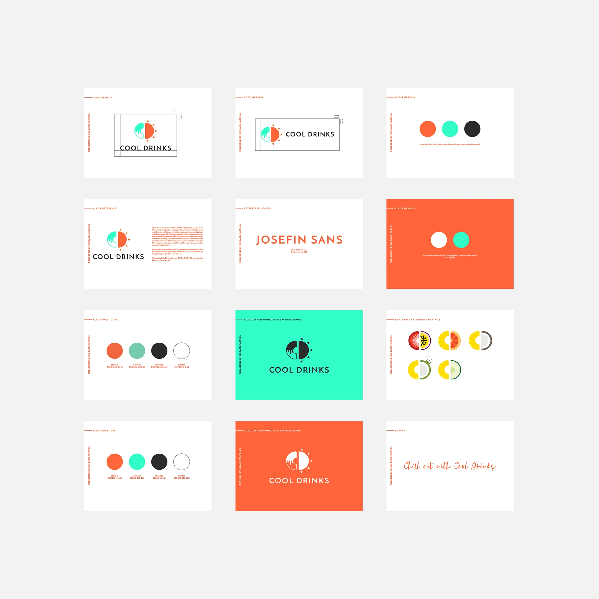
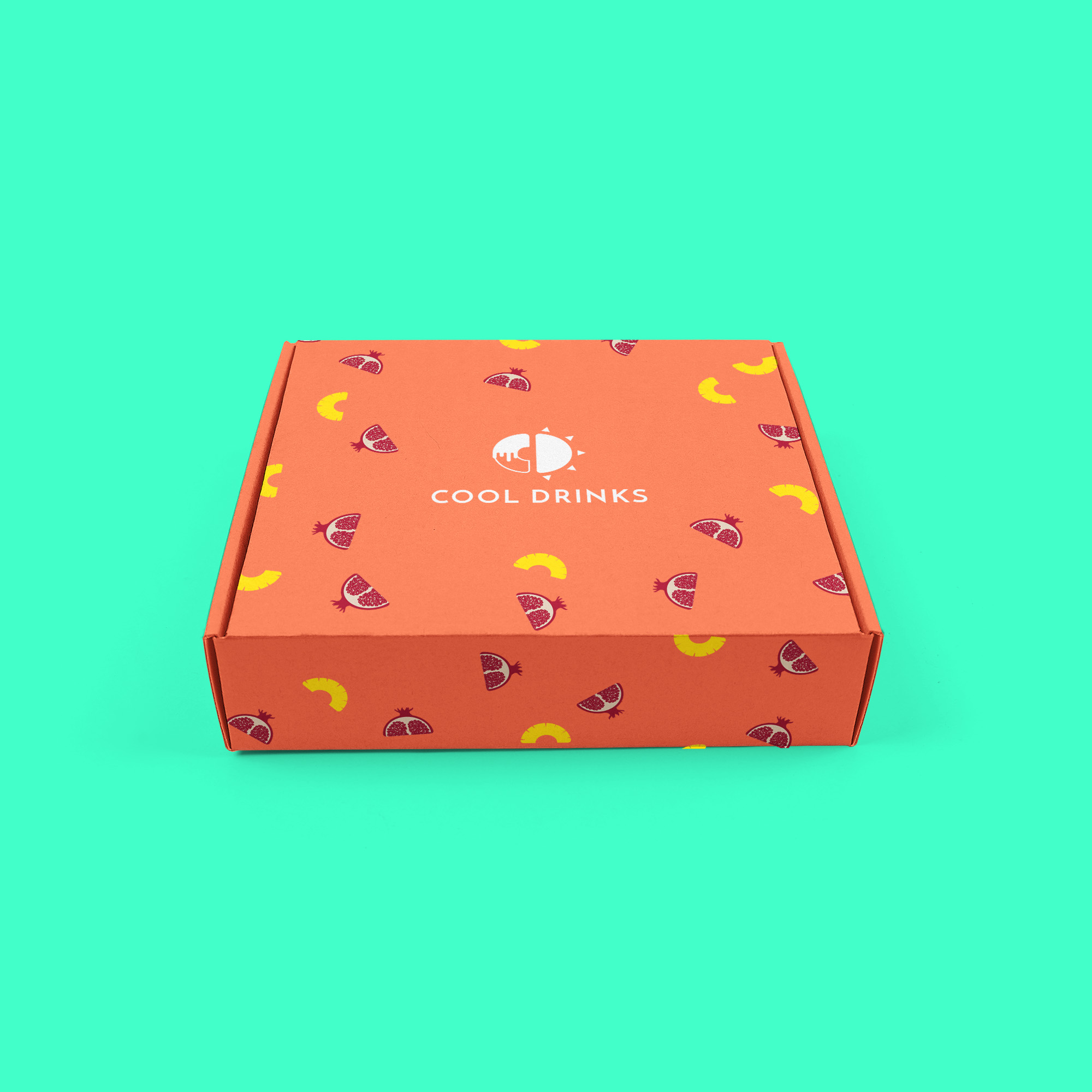
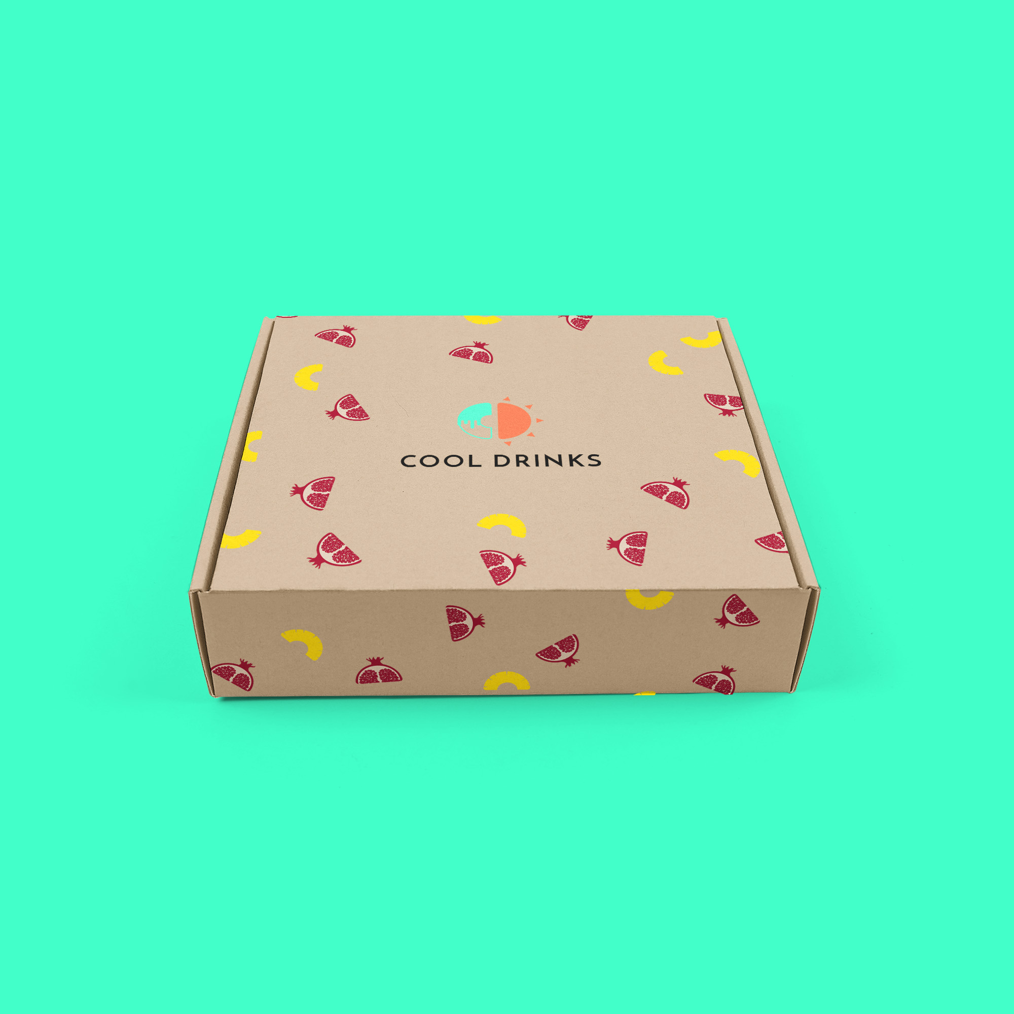
The logo
I began the project by focusing on the logo design. I used the initials of Cool Drinks, the C and D, as my starting point. The concept behind the logo was inspired by the idea of “sipping an ice-cold drink on a hot summer day.” This led to the creation of a strong contrast between hot and cold within the letters C and D, visually capturing the essence of the brand.
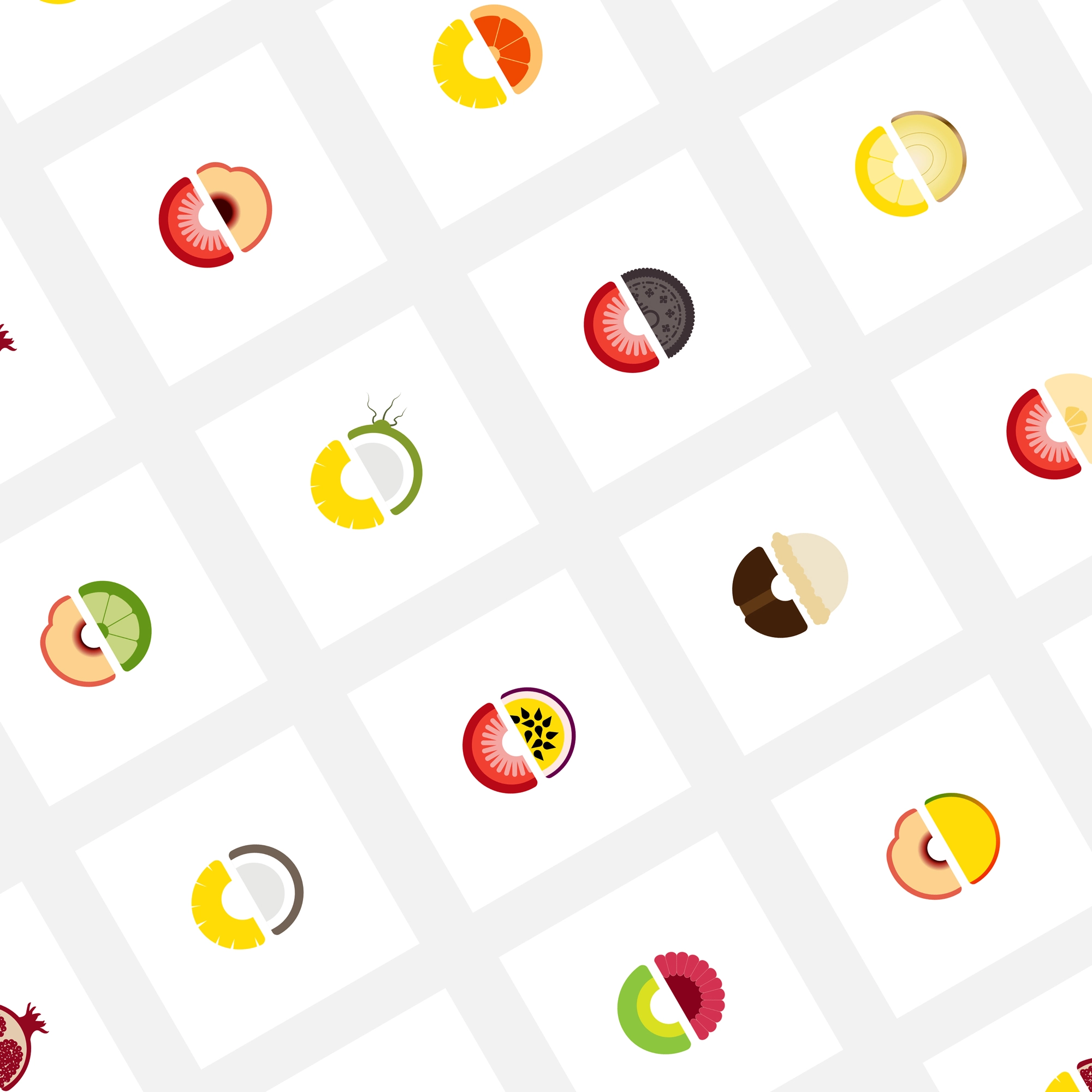
The secondary logo
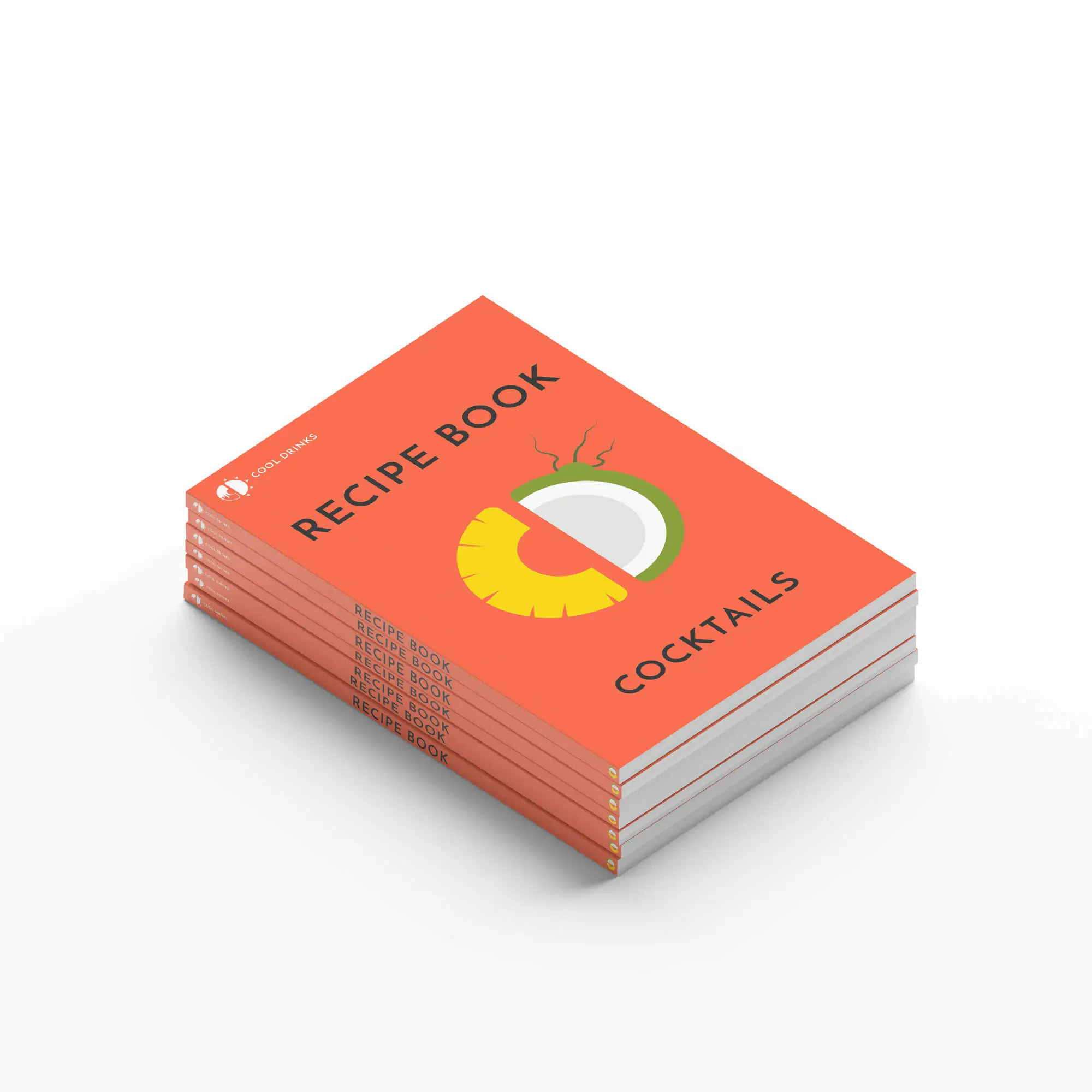
Cool Drinks offers a wide variety of beverages, including smoothies, cocktails, iced cappuccinos, milkshakes, and lemonades. For their recipe books, I created secondary logos where the C and D are transformed into corresponding ingredients. For example, the C is turned into a lemon and the D into a coconut, reflecting the diverse range of drinks they provide. This approach makes the brand more colorful, summery, and playful, aligning with the desired brand identity.
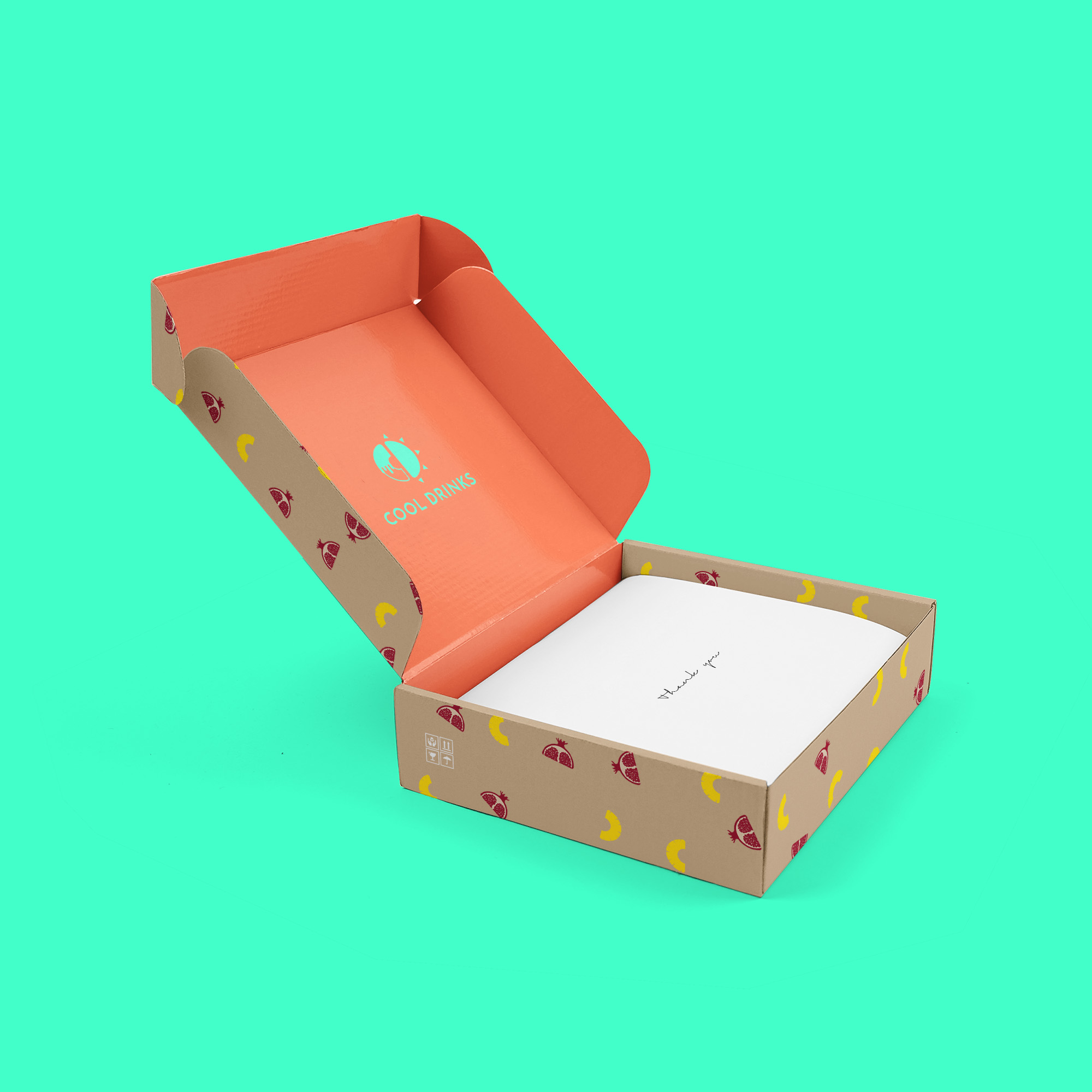
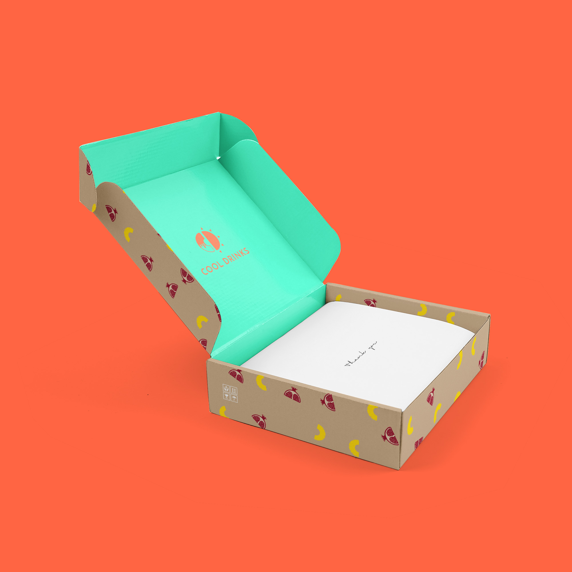
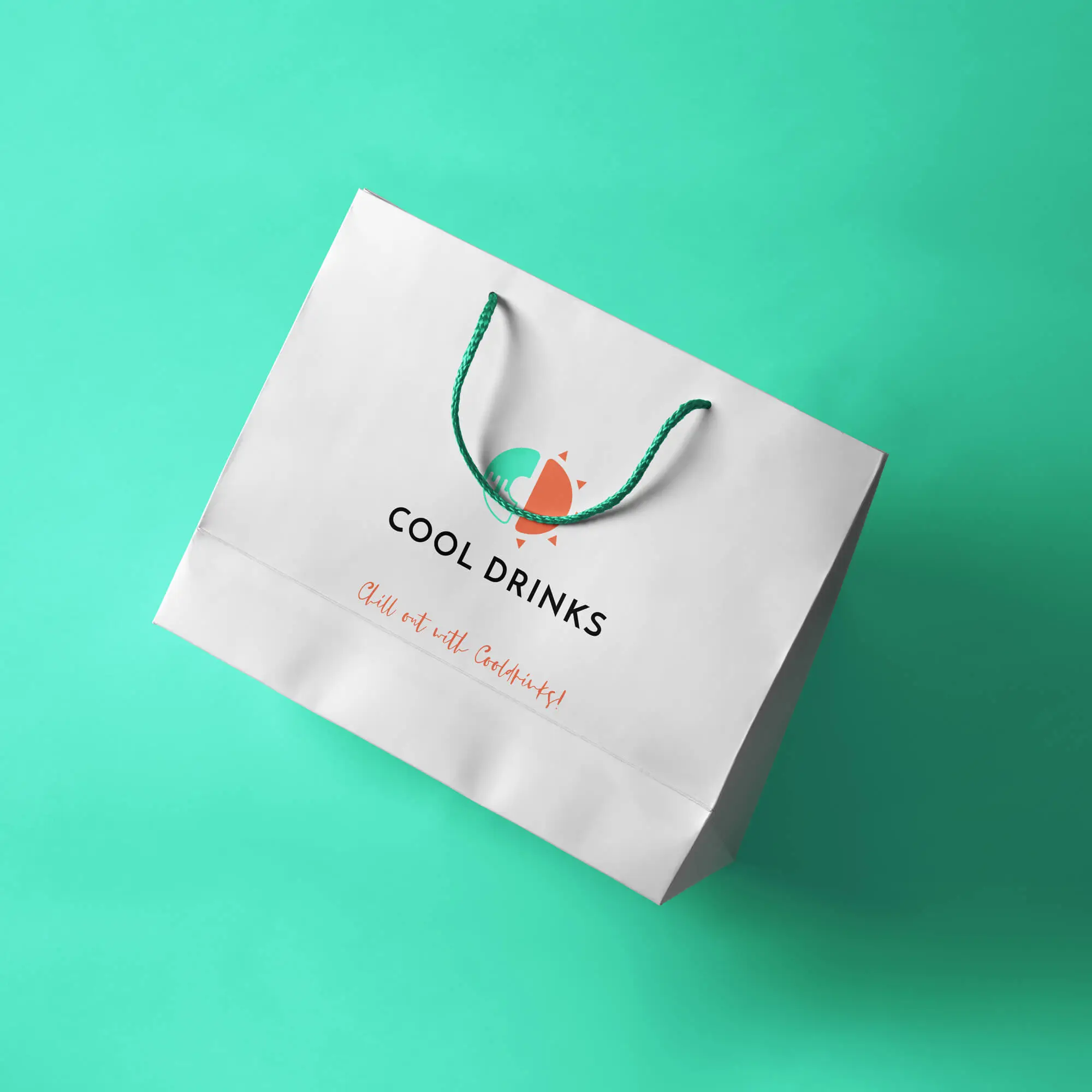
The brand book
After designing the primary and secondary logos, I chose the colors and typography to complement the brand’s identity. All these elements were documented in a comprehensive brand book.
About the company
Cool Drinks is the supplier of Island Oasis products in the Benelux. Island Oasis products are used by hospitality establishments, providing great ease of use in making the most delicious drinks.
Case
The company had an outdated brand identity that no longer resonated with its target audience. I was tasked with revitalizing their image by developing a fresh, summery brand and logo. This involved a complete redesign of their visual elements, including color schemes, typography, and imagery, to evoke a sense of warmth and refreshment. The goal was to create a cohesive and appealing look that would attract and engage customers, ultimately aligning the company’s visual identity with its core values and market positioning.
The logo
I began the project by focusing on the logo design. I used the initials of Cool Drinks, the C and D, as my starting point. The concept behind the logo was inspired by the idea of “sipping an ice-cold drink on a hot summer day.” This led to the creation of a strong contrast between hot and cold within the letters C and D, visually capturing the essence of the brand.
The secondary logo
Cool Drinks offers a wide variety of beverages, including smoothies, cocktails, iced cappuccinos, milkshakes, and lemonades. For their recipe books, I created secondary logos where the C and D are transformed into corresponding ingredients. For example, the C is turned into a lemon and the D into a coconut, reflecting the diverse range of drinks they provide. This approach makes the brand more colorful, summery, and playful, aligning with the desired brand identity.
The brand book
After designing the primary and secondary logos, I chose the colors and typography to complement the brand’s identity. All these elements were documented in a comprehensive brand book.
You’ve reached the end 🥳
© 2024 anna by Anna Tai